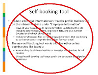
Write your script before creating your presentation. This will help you keep track of your main points and figure out how best to show that in a visual way. As with any good speech; make sure there is a beginning, a middle, and an end. Laying it out as an outline can help you come up with the bullet points you will use on your slides. You want your audience to appreciate each slide and be anxiously awaiting the next one.
The screen should show only the point you're currently making. The audience will ready every slide as it is displayed, they will read ahead and not pay attention to you if the next three points are showing. Structure your presentation so that bullet points are revealed one at a time as you reach them. If you have charts or videos to emphasize a point, put them in a separate slide so they command full attention. Remember that your role as the presenter is to control the flow of information so the audience can feel the full impact of your points.
Remember that the presentation is not meant to be a stand-alone document, not every word you want to say has to be included on the slide. You will end up with large blocks of text that will be difficult for the audience to read and follow. Having your whole presentation script on the slide also tends to cause the speaker to turn his or her back to the audience and read, which is both rude and boring (the exact opposite of effective!). The slides should illustrate your presentation and reinforce your points. The paragraphs should be kept to the speaker's notes area that the audience does not see.
Presentation software has many options for adding visual flashes to your slides including things like fades, swipes, and flashing texts. Avoid the temptation to add these items in for the sake of themselves and instead concentrate on simple design basics to make impact.
- For the body and text use easily read fonts such as Arial, Helvetica, or Calibri.
- Only use decorative fonts (calligraphy, art nouveau, etc.) for slide headers.
- Put dark text on light background or light text on dark background.
- Align text either left or right.
- Avoid clutter on your slides.
With these few easy tips, you can create a presentation that wows the audience and lands that sale.


No comments:
Post a Comment